Game levels are the building blocks of gameplay. Well-designed levels guide players on an exciting journey filled with challenges to overcome, stories to uncover, and skills to master.
But creating great game levels is far from easy. Even experienced designers can fall into traps and pitfalls that sabotage the player experience.
In this comprehensive guide, we’ll dive deep into the most prevalent issues that plague game level design. We’ll dissect real-world examples and walk through proven solutions to avoid these problems in your own projects.
Whether you’re building sprawling 3D worlds or tight 2D side scrollers, you’ll find tips here to polish your level design skills. Let’s get started!
The Pitfalls and Most Common Problems in Game Design
Overview of Common Level Design Problems
Before we dive into the details, here’s a high-level overview of some of the most common pitfalls covered in this guide:
- Overwhelming scale and complexity – Levels that are too large or convoluted quickly become disorienting
- Excessive enemy density – Combat suffers when too many foes are crammed together
- Unclear objectives and wayfinding – Players get frustrated when goals and direction are ambiguous
- Repetitive and boring tasks – Rote challenges sap engagement
- Unsatisfying difficulty curves – Progression feels off with jagged spikes and plateaus
- Levels disconnected from story – Gameplay and narrative feel disjointed
- Lack of playtesting and iteration – Flaws go unaddressed without extensive testing
Careful planning and playtesting can help identify and fix these issues in level design. Let’s explore each problem in detail.

Problem #1: Overwhelming Scale and Complexity
Creating massive worlds and convoluted levels may seem exciting initially. But in practice, too much size and complexity often undermine great gameplay.
The Problem with Overwhelming Scale and Complexity
When designing levels, it’s tempting to go big. REALLY big. Wide open worlds that would take hours just to cross on foot. Labyrinthine dungeons with endless rooms and corridors. Interconnected zones crammed with places to explore.
Creating epic-scale levels seems exciting initially. But in practice, massive size and complexity often undermine great gameplay. Too much space leads to aimless wandering. An overabundance of intersecting paths causes frustration. Exploring gradually stops feeling fun.
Examples of Overly Large Levels
- Daggerfall – This open world RPG from 1996 is notoriously huge. With over 15,000 towns and a gameworld larger than Great Britain, hours can be spent simply walking between points of interest. But much of that in-between time feels like empty padding.
- Wasteland – This 1988 post-apocalyptic RPG has dense, convoluted dungeon levels like the Finster Museum. Twisty halls spill into dozens of rooms, with crucial items hidden in obscure corners. Players easily get lost down endless detours.
How to Avoid Overwhelming Scale and Complexity
Here are some tips to keep scale and complexity manageable:
Clearly Define the Core Path
- Even in nonlinear levels, make sure there is a clear critical path for players to follow
- Use visual cues, landmarks, chokepoints and other design elements as “breadcrumbs” to keep players oriented in the right direction
- Open world games often employ “golden paths” – suggested routes that take players past important waypoints while allowing for diversion and side exploration
Playtest for Pain Points
- Watch playtesters carefully as they navigate your levels
- Make note of areas where they seem lost, frustrated, or disengaged
- Ask for direct feedback on confusing sections
- Refine and simplify parts that test poorly
Use Wayfinding Features
- Include mini-maps, quest markers, objective pointers to help orient players
- Use environmental signifiers like landmarks, foliage changes, architecture variations
Set Clear Size Limits
- Scope each level down during concept phase to fit budget, schedule and team
- Be disciplined about cutting superfluous spaces that bloat levels without adding real value
Key Takeaway
Complexity and scale can easily spiral out of control. But with intentional design, you can create levels that feel open yet satisfyingly navigable for players.
Problem #2: Excessive Enemy Density
Cramming too many enemies into close quarters quickly makes gameplay feel spammy and frustrating rather than fun.
The Problem with Excessive Enemy Density
Some designers try to increase difficulty by overloading levels with enemies. But this backfires when taken too far. Densely packed enemies bring all sorts of issues:
- Combat becomes repetitive and mindless rather than tactical
- Exploration is bogged down by constant attacks
- Enemies block paths, doors, interactive objects
- Resources are quickly drained due to relentless assaults
- Individual enemies lose significance
Examples of Excessive Enemy Density
- Devil May Cry – The original 2001 game was designed around long combat sessions against swarms of weaker foes. But many players felt combat became exhausting and monotonous rather than exhilarating.
- Tomb Raider (2013) – This reboot received criticism for throwing too many enemies at once against the player in certain areas. Combat started to feel more like a chore than a balance of action and exploration.
How to Avoid Excessive Enemy Density
Here are some tips for pacing enemy encounters:
Space Out Encounters
- Give players time to recover between battles – don’t just think about individual enemy placement
- The space between fights should be proportional to their size and difficulty
- A massive brawl should be followed by extended down time
Map Difficulty Curves
- Plot combat difficulty on a curve throughout the level, with ebbs and flows in intensity
- Carefully pace high- and low-density combat to not overwhelm players
- Steady escalation is key – avoid wild difficulty swings
Use Metagates
- Metagates are transitional spaces between combat arenas that let players prepare
- Examples: Short corridors, sealed doorways, elevators
- They naturally space out enemy groups rather than forcing them together
Playtest Extensively
- Observe real players battling enemies to gauge appropriate density
- Watch for signs of monotony and exhaustion
- Listen for direct feedback – increase or decrease density accordingly
Key Takeaway
With intentional spacing and gating of enemy groups, you can design density that feels intense but not overwhelming.

Problem #3: Unclear Objectives and Wayfinding
Getting lost because your task and path forward are opaque is a quick way to lose player engagement.
The Problem with Unclear Objectives and Wayfinding
Quest goals, objectives, and level exits should be strongly telegraphed. But often fundamental wayfinding is neglected. Designers forget to communicate what needs doing and where players should be headed. Some common issues include:
- No main quest or side objective clearly presented upon entering
- Cryptic notes or clues that leave objectives ambiguous
- Poor instructions for multi-step goals
- Minimal visual cues guiding navigation
Examples of Unclear Wayfinding
- Star Wars: The Old Republic – Early versions were criticized for the lack of clear main story direction on planetary hubs. With vague narrative threads, players struggled to determine where to go next.
- The Legend of Zelda: Ocarina of Time – The Water Temple exemplifies poor within-level wayfinding. With convoluted multi-floor architecture and complex water level mechanics, players easily get turned around and lost.
How to Avoid Unclear Objectives and Wayfinding
Here are some tips for communicating objectives and ideal paths:
Explicitly State Objectives
- Don’t make players hunt to figure out goals – state them upfront via UI text, dialog, etc
- Provide actionable specifics on what completing the objective entails
Use Visual Cues
- Reinforce objectives with strong visual signifiers drawing attention
- Examples: landmark structures, color contrasts, lighting, particle effects
Communicate Multi-Step Goals
- Break down longer objectives into discrete, sequential steps
- Indicate order and dependencies if steps must be completed sequentially
Playtest Wayfinding
- Watch for objectives or directions that testers struggle to parse
- Ask for feedback on confusing parts – refine based on this
Key Takeaway
With clear direction and strong visual signposting, you can craft levels that propel purposeful forward progress.
Problem #4: Repetitive and Boring Tasks
Monotony often creeps its way into level tasks, puzzles and other activities. Players quickly disengage with repetitive challenges.
The Problem with Repetitive and Boring Tasks
Few things torpedo engagement faster than repetitive level elements. Unfortunately monotony often creeps its way into tasks, puzzles and other activities.
The absolutely worst offender? Reusing the exact same task or puzzle templates over and over without variation. This turns gameplay into a numbing chore:
- Defeat the enemies in this room to open the barrier
- Find the three hidden cubes to unlock the door
- Push the crate onto the switch to lower the bridge
Basic templates are fine starting points. But mimicking the same types of challenges continually breeds boredom quickly.
Another common mistake is drawing out individual tasks or puzzles for too long. What initially seemed engaging wears out its welcome midway through.
Examples of Repetitive Level Design
- Assassin’s Creed Odyssey – Many criticized the drawn out and repetitive fort clearance loops. Those long multi-stage assaults grew stale after clearing dozens of identical bandit strongholds.
- Destiny 2 – The early story missions reuse variations of “go here, insert the thing, fight enemies” tasks over and over. Repetitive objectives and similar geometry got dull quickly.
How to Avoid Repetitive and Boring Tasks
Here are some strategies to maintain engagement:
Use Diverse Mix of Tasks
- Pull challenges from a wide pool of activity types
- Mix up navigation challenges, resource gathering, collection quests, miniboss battles etc
- Rotate among categories to mitigate repetition
Disguise Repeated Templates
- Reusing templates isn’t inherently bad if you re-skin them with different narrative flavor
- For example, contextualize pressure plate puzzles differently as weighing cargo, docking power sources etc
Keep Tasks Concise
- Trim the fat to avoid dragging tasks on too long
- Err on the side of activities being too short rather than overstaying their welcome
Analyze Level Flow
- Zoom out and analyze flow – look for spots where cadence slows due to repetition or boredom
- Pay close attention to playtester feedback around engagement
Key Takeaway
With a diversity of activities that exit before going stale, you can maintain player engagement from start to finish.
Problem #5: Unsatisfying Difficulty Curves
The challenge level should steadily ramp up to stay engaging without being discouraging. But often, the difficulty curve feels erratic.
The Problem with Unsatisfying Difficulty Curves
A great level dances the player along a razor’s edge between boredom and frustration. The challenge escalates steadily as their skills ramp up. When done right, this difficulty curve is immensely satisfying.
But often, the curve warps into shapes that don’t deliver a smooth ride. You experience jarring spikes or lifeless plateaus. The tension falls apart.
Some common missteps with difficulty progression include:
- Starting off way too easy then escalating difficulty rapidly
- Brick wall spikes late in level after a boring early game
- Climaxing with disappointingly simple levels after taxing mid sections
- Zig-zagging erratically between hard and easy
Examples of Poor Difficulty Curves
- Destiny 2 – The linear story difficulty starts very easy but ends with dramatic spikes. Players breeze through then hit unexpected walls.
- Cuphead – The run-and-gun levels oscillate between manageable and controller-smashingly hard, with little middle ground. This polarity frustrates many players.
How to Avoid Unsatisfying Difficulty Curves
Here are tips for honing difficulty progressions:
Plot It on a Curve
- Graph out difficulty over your level on a line to visualize the progression
- Look for sharp spikes or drops, and plateaus signalling pacing issues
- Smooth out the curve – ideal shape is a smooth ramp gaining elevation
Steady Escalation is Key
- Keep difficulty increases gradual as players progress
- Stay just ahead of players’ expanding skills – but not so far they can’t keep up
Playtest and Adjust
- Note sections playtesters found particularly punishing or dull
- Based on feedback, rebalance parts that feel off
- Iterate until the arc feels smoothly satisfying
Key Takeaway
With incremental escalation that flexes to match player skills, your difficulty curve will deliver engaging flow.

Problem #6: Levels Disconnected From Story
In story-driven games, levels shouldn’t just function as gameplay spaces. They also need to meaningfully contribute to and enhance the surrounding narrative.
The Problem with Levels Disconnected From Story
But often level design and story feel strangely detached rather than woven together. There’s a jarring schism between the gameplay challenges and the narrative context meant to ground them.
Some common issues include:
- Level objectives feel tacked on and arbitrary, with thin narrative rationale
- No real ties to characters, plot events, or story themes
- Gameplay undercuts rather than reinforces the established fiction
- Shifting fictional contexts between levels with no transition
Key Takeaway: Integrate levels tightly with narrative context.
Examples of Disconnected Levels
- Mass Effect – The original was panned for bland side missions disconnected from the main story. These generic fetch quests didn’t meaningfully expand the narrative.
- Aerannis – This indie game suffered from gameplay that conflicted with story tone. Bright cartoon aesthetics jarred against serious subject matter about transgender identity.
How to Avoid Levels Disconnected From Story
Integrate Levels into the Plot Arc
Don’t develop levels in isolation – interweave them with the beats of your story. Let narrative context inform objectives. Assign characters and events integral roles guiding the player through levels.
Each level should feel like both a gameplay challenge AND a narrative moment moving the story forward.
Maintain Tonal Consistency
Make sure the style, aesthetics and vibe of levels match and reinforce the fictional setting. Don’t whip the player tonally back and forth between levels. Maintain cohesive creative direction.
For example, a noir detective story should stick with moody, atmospheric level design – not shift into bright flashy spectacle for a specific mission.
Use Environmental Storytelling
Have the level environments themselves convey narrative information through visual details that implicitly tell small stories. No need for heavy exposition – let the spaces speak volumes through thoughtful design.
Show, don’t tell stories about what happened in a ruin, laboratory, or mysterious cavern through careful environmental clues.
Playtest Story Resonance
Ask playtesters pointed questions about how levels made them feel – did they reinforce or betray the tone of the world? Did the objectives feel grounded in the story or arbitrarily tacked on?
Use this feedback to evaluate and strengthen story-gameplay cohesion moving forward.
Case Study: Uncharted’s Levels That Double as Story Moments
The Uncharted series excels at making its levels feel like seamless parts of the narrative experience.
How They Achieve It
- Environments visually match the fictional setting
- Objectives emerge naturally from the story circumstances
- Levels feature characters that drive plot forward
- Tone and pacing fit the narrative genre
- Environmental clues expand on the game world lore
Naughty Dog builds levels that feed into and bolster the story at every turn – true ludonarrative harmony!
Levels that tightly interlock with narrative context transform gameplay into story progression. When they work in unison, you achieve true immersion.
Problem #7: You don´t play test and iterate
Many design issues only reveal themselves once levels are actively playtested. But often, levels receive only cursory testing before being locked down.
The Problem with lack of playtesting and iteration
Without serious iteration cycles, levels ship lacking crucial polish. Hallmarks of insufficient testing and revision include:
- Flow and pacing hiccups become apparent, but too late
- Difficulty tuning feels inconsistent and untested
- Unengaging sections linger unchanged
- Confusing mechanics aren’t clarified
- Bugs abound
A 2016 study of 5000 game projects found that titles with thorough playtesting had criticism rates under 20%. Those with little testing garnered criticism over 3x higher. Testing mattered more than budget or schedule.
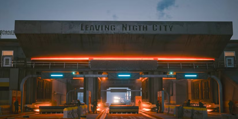
Case Study: Cyberpunk 2077
The disastrous launch state of Cyberpunk 2077 in 2020 illustrates the perils of inadequate playtesting before release. Myriad issues around bugs, performance, UI, and gameplay design persisted. Earlier and more extensive testing may have surfaced and addressed these problems sooner.
Key Takeaway: Playtest early, often, and right up until launch.
How to Avoid lack of playtesting and iteration
Start Playtesting Early
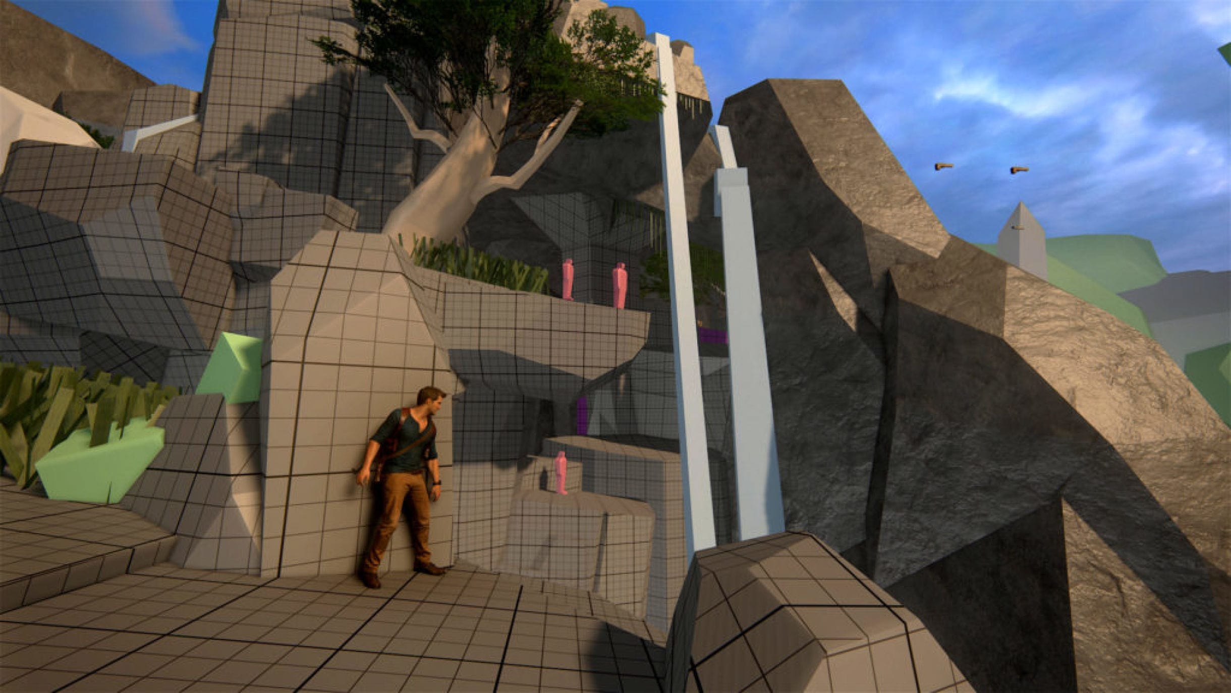
Don’t wait until levels are nearly complete to playtest them. Start as soon as gray blocking is finalized and the overall shape takes form. The earlier issues can be found, the better.
- Begin playtesting as soon as gray blocking is finalized and overall shape takes form
- The earlier issues can be found, the better
Test Often and Iterate
Schedule frequent play test sessions focused on specific sections or mechanics. Let testing guide an ongoing process of iteration. Be willing to make major changes based on feedback.
- Schedule frequent test sessions focused on specific sections or mechanics
- Let testing guide ongoing iteration – be willing to make major changes
Observe Players Closely
During testing, watch players like a hawk. Note exactly where they struggle, get stuck, or lose interest. Listen to their feedback, but also rely on your observations.
- Note exactly where testers struggle, get stuck, or lose interest
- Listen to feedback, but also rely on your observations
Get Fresh Perspectives
Don’t just playtest internally. Bring in external testers to give objective feedback. They catch issues teams have become blind to through familiarity. Fresh eyes are invaluable.
- Bring in external testers to provide objective feedback
- They catch issues teams have become blind to through familiarity
Refine Until the End
Don’t stop meticulous testing and tuning after hitting beta or release candidate milestones. Expect to keep iterating right up until launch day – treat it as the final stretch rather than the finish line.
- Don’t stop meticulous testing and tuning after hitting beta or release candidate milestones
- Expect to keep iterating right up until launch day
Case Study: How Nintendo Playtests Levels
Nintendo’s designers are masters of iteration fueled by rigorous playtesting. Here are some of their best practices:
- Playtest several times per week to get rapid feedback
- Testers play while designers observe everything closely
- Levels are refined daily based on playtest findings
- Playtesting continues all the way until final master deadlines
This commitment to ongoing iteration results in their signature polish and game feel.
3 Playtesting Best Practices
To extract maximum value from playtests, be sure to:
- Recruit fresh testers who bring objective perspectives
- Take copious notes on feedback and observations
- Prioritize changes based on playtest insights
Robust playtesting and iteration results in smooth, engaging level flow. Don’t leave it as an afterthought!
Key Takeaway
With ongoing playtesting and revision, you can achieve that elusive “fingerprints of the maker” level of craftsmanship.
Problem #8: Artificial Barriers
Invisible walls, locked doors, impassable terrain. Restricting player movement often feels necessary to contain them within intended play spaces.
But clunky artificial barriers shatter immersion. These jarring reminders that you’re trapped in a virtual box undermine the sense of exploration.
Some common artifical design barriers include:
- Arbitrary invisible walls along edges or between zones
- Map borders that abruptly halt you without explanation
- Insurmountable terrain like mountains or pits that look traversable
- Impassable barriers that feel suspiciously convenient
Key Takeaway: Communicate restrictions clearly through smart level architecture.
How to solve Artificial Barriers
Embrace Natural Barriers
Rather than relying on artificial barriers, leverage logical parts of your environment design to containment. Impassable forests, rivers, ravines, cliffs, fences, ruins, mountains, swampy bogs all make sense.
Think how your level fiction can justify its boundaries organically vs abruptly halting player movement.
Close Loops and Connect Zones
Consider looping paths, tunnels, and transitions between zones rather than hard cuts between areas. If you stitch together spaces cohesively, fewer artificial gates are needed.
Linking areas through transitional spaces maintains the illusion of a larger continuous world beyond the playspace.
Playtest for Immersion
As playtesters navigate your levels, watch for places the barriers stand out awkwardly. Get feedback on elements that break immersion or feel artificially restrictive.
Iterate on better integrating restrictions into the environment itself. Barriers that make fictional sense stand out much less.

Case Study: Breath of the Wild’s Open Design
Nintendo’s Breath of the Wild shows how smart level architecture can minimize artificial barriers.
Their Approach
- Whole zones organically walled in by mountains, oceans, forests
- Towers reveal more of the continuous open world
- Cave openings, passes between zones avoid loading
- Climbing and gliding let you traverse more organically
This combination of open interconnectedness with natural barriers deepens immersion in the world.
When restrictions make contextual sense, players rarely chafe against them. Take care to keep your boundaries integrated into the fiction.
3 Tips for Immersive Barriers
Follow these guidelines when restricting player navigation:
- Leverage logical environmental features as barriers
- Connect zones visually through gateways and horizons
- Playtest for areas where barriers break immersion
Problem #9: Checkpoint Imbalance
Checkpoints are critical fail-safes that protect player progress. But their placement greatly impacts tension and pacing. Put too many, and challenge dwindles. Spread them too thin, and frustration sets in.
Bad checkpoint tuning includes:
- Placing saves too close together, ruining challenge escalation
- Checkpoints too rare or inconsistent, causing frustrating repetition
- Saves right before difficult sections, robbing climaxes of impact
Key Takeaway: Carefully tune checkpoint density, spacing, and location.
How to solve Checkpoint Imbalance
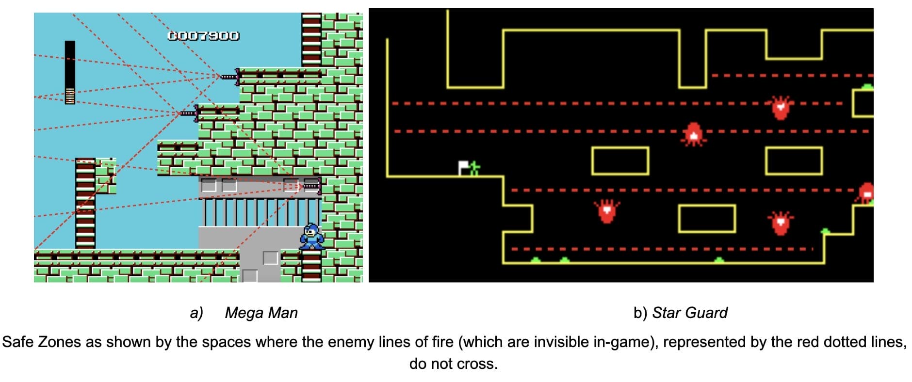
Analyze Checkpoint Frequency
When laying out save points, step back and analyze their frequency across the entire level. Are they well spaced or clustered? Does this spacing match the pacing of challenges?
Ask yourself: does the current distribution match the ideal cadence? Or should density be increased/decreased?
Link Saves to Set Pieces
Look for logical linkages between save points and level set pieces. Saves often make natural punctuation between major combat arenas, challenges, or story beats. This provides a periodically paced rhythm.
Also consider pacing ramps TOWARD each set piece. Don’t deflate tension by saving right before climactic moments.
Watch for Player Frustration
During playtesting, observe how far and how often players have to replay sections after mistakes or deaths. Note any sections that prove particularly frustrating to have to repeat frequently.
Add additional checkpoints if repetition goes on too long, especially near difficulty spikes.

Case Study: Destiny’s Checkpoint Controversy
Player outcry over sparse checkpointing in Destiny showcases the impact of bad save tuning.
The Issues
- Many sections forced 5-10 minutes of repetition after each death
- Long boss fights had only one distant checkpoint
- Caused huge frustration having to re-tread so much ground
How They Fixed It
- Patched in more frequent checkpoints throughout levels
- Added new mid-fight saves during lengthy boss battles
- Reduced maximum runback time after failures
With careful checkpoint placement informed by playtesting, you can nail the right density and spacing to match your game’s flow.
3 Checkpoint Tuning Tips
Follow these principles when positioning checkpoints:
- Space evenly based on section length and difficulty
- Avoid saving right before climaxes
- Playtest for frustration hotspots and iterate
Problem #10: Hidden Elements
Exploration is only rewarding if it reveals something interesting. But often critical paths, items and interactions are obscured to the point of player frustration.
Players expect challenges while navigating your spaces. But the navigation itself shouldn’t be the challenge due to lack of signposting.
Some common issues around insufficiently highlighted elements include:
- Obscure hidden paths blending into environments
- Collectibles with no cues directing you to them
- Unclear level goals and routes forward
- Puzzles with solutions too visually ambiguous
Key Takeaway: Ensure critical elements are prominently visible.
How to solve the problem with Hidden Elements
Highlight Interactive Elements
Anything players need to notice and interact with should be prominently called out. Use visual prominence, audio cues, UI prompts, character dialog, camera direction and other tactics to draw attention.
Err on the side of overt communication – don’t make players hunt and peck searching for the next key interaction.
Use Visual Hierarchy
Establish a strong visual hierarchy that directs player gaze towards important objects and areas. Contrast values, saturation, depth of field, lighting and more can emphasize points of focus.
The goal is staging compositions where critical items naturally attract attention – not blend into obscurity.
Design Visibility First
When modeling environments and placing items, make visibility a top criteria that trumps “realism.” Even if an object would realistically be hidden, expose it for the sake of clarity.
Remember that you’re designing spaces to explicitly guide players – not passively emulate reality. Prioritize purpose over accuracy.
Case Study: How Valve Guides Players
Valve’s games are legendary for their artful player direction. Some techniques they excel at include:
- Geometry that draws the eye towards openings and items
- Contrast and color to establish visual hierarchy
- Character animation and gaze that lead your perspective
- Audio cues to attract attention
- UI reminders and markers for extra emphasis
Valve masters the art of subtle visual signals that direct while retaining immersion.
With well-designed affordances and signifiers, you can avoid frustrating pixel hunts. Draw players toward discoveries – don’t hide the goods.
3 Tips for Visible Elements
Follow these guidelines to ensure elements read clearly:
- Establish visual hierarchy and points of focus
- Playtest visibility and add more cues as needed
- Prioritize clarity over realism if needed
Recap of Solutions for Common Problems
Let’s recap some of the key solutions covered for avoiding common level design pitfalls:
Overly Large and complex Levels
- Clearly define critical paths
- Playtest for pain points
- Use wayfinding features
- Enforce size limits
Excessive Enemies
- Space out encounters
- Map difficulty curves
- Use gating and pacing
- Playtest density extensively
Unclear Objectives
- Explicitly state objectives
- Use visual signifiers
- Communicate multi-step goals
- Playtest wayfinding
Repetitive Tasks
- Use diverse activities
- Disguise reused templates
- Keep tasks concise
- Analyze flow and cadence
Unsatisfying Difficulty
- Graph out progression
- Focus on steady escalation
- Playtest and iterate
Disconnected Levels
- Integrate levels into narrative
- Maintain tonal consistency
- Leverage environmental storytelling
- Playtest story resonance
Inadequate Playtesting
- Start testing early
- Test often and iterate rapidly
- Observe players closely
- Get fresh perspectives
- Keep refining until the very end
Artificial Barriers
- Use natural barriers
- Connect zones cohesively
- Playtest immersion
Checkpoint Imbalance
- Analyze frequency and spacing
- Link saves to set pieces
- Watch for repetition frustration
Hidden Elements
- Highlight interactive elements
- Establish strong visual hierarchy
- Design visibility before realism
- Playtest readability
By dodging these pitfalls, you can craft captivating game spaces that keep players engaged from start to finish!
With knowledge of common pitfalls and solutions in mind, you can craft polished levels that withstand the scrutiny of real players.
Rigorous playtesting and iteration is the key to surfacing flaws while there’s time to address them. Don’t leave it as an afterthought!
Conclusion: Pitfalls and Most Common Problems in Game Design
Creating highly playable levels is an art beyond mastering the technical skills. An eye for pacing, flow, escalation and dramaturgy ends up being just as important.
This guide provides a blueprint of common pitfalls that disrupt engaging player experiences in navigating virtual spaces. By scrutinizing your own designs through the lens of these anti-patterns, you can identify weaknesses while there is still time for improvement.
Always stay vigilant for issues by thoroughly playtesting levels and observing real human players. Their reactions reveal what remains rough and frustrating. With a commitment to iteration before launch, you can sand down any rough edges into smooth seamless gameplay.
Game spaces crafted holistically to challenge, support, direct and immerse result in delightful experiences flattering to their architects. We hope these tips help you avoid missteps on the road to reaching that satisfying destination.
Now it’s time to put these lessons into practice. Grab your map editors, block out some intriguing virtual environments, invite some testers, and watch them play. Keep refining based on what you observe. You’ve got this!
We’d love to hear about your own biggest takeaways from this guide, as well as any additional pitfalls you’ve encountered on your game projects. Please leave a comment below sharing your insights or asking follow-up questions.
And if you found this guide helpful, be sure to bookmark the site and share it with fellow designers who can benefit from level design best practices. Let’s keep the conversation going and skill up together!
If you want to read more articles about errors in game design be sure to check our blog.
Frequently Asked Questions (FAQ) Pitfalls and Most Common Problems in Game Design
Q: What is game design?
A: Game design is the process of creating the rules, mechanics, gameplay, and overall structure of a video game.
Q: What is the design process in game design?
A: The design process in game design refers to the systematic approach that designers follow to conceptualize, develop, and iterate on a game’s design.
Q: What are some common problems in game design?
A: Some common problems in game design include balancing gameplay difficulty, creating engaging mechanics, designing immersive environments, addressing technical limitations, and managing scope and resources.
Q: How can I fix gameplay balancing issues in my game?
A: To fix gameplay balancing issues in your game, you can playtest extensively, gather feedback from players, adjust difficulty levels, and iterate on your design based on the collected data.
Q: What are some design challenges that game designers face?
A: Game designers face various design challenges, such as creating a compelling story, designing interesting levels, balancing gameplay mechanics, and appealing to the target audience.
Q: How important is immersion in game design?
A: Immersion is crucial in game design as it helps players feel fully engaged and immersed in the game world, enhancing their overall experience.
Q: How can I create immersive game environments?
A: To create immersive game environments, you can focus on creating detailed and visually appealing game art, designing realistic and interactive game mechanics, and incorporating sound design and music that enhances the atmosphere.
Q: What role does the design team play in game development?
A: The design team in game development is responsible for conceptualizing and designing the game’s mechanics, levels, characters, and overall gameplay experience.
Q: How can I keep a player engaged throughout the game?
A: To keep a player engaged throughout the game, you can ensure a balanced difficulty progression, provide meaningful challenges, offer rewards and incentives, and create an immersive and captivating story or world.
Q: What are some good examples of game design?
A: Some good examples of game design include games like “The Legend of Zelda: Breath of the Wild,” “Super Mario Odyssey,” and “The Witcher 3: Wild Hunt,” which are known for their engaging gameplay, immersive worlds, and innovative mechanics.


