Color Theory Basics for Game Environment Design: How Artists, Designers, and Engineers Use Color to Shape Emotion, Guide Players, and Build Immersive Worlds
Key Takeaways
- Color Psychology Drives Behavior: Strategic color choices can directly influence player decision-making and have been shown to increase player engagement by up to 40%. Dynamic color systems that adapt to the narrative can even lead to 25% higher retention rates.
- A Strong Value Structure is Non-Negotiable: Before even thinking about hue, professional artists build a scene’s foundation on value (lightness and darkness). An environment that is readable in grayscale will have a clear visual hierarchy and depth, which color can then enhance.
- Color is a Technical Discipline: The final color you see on screen is not just a texture; it’s a dynamic result of physically-based materials interacting with lighting, shadows, and post-processing effects. Mastering tools within game engines is as crucial as understanding art theory.
- Accessibility and Cultural Awareness Are Essential: Designing for the 8% of male players with color vision deficiency isn’t just ethical, it’s profitable. Furthermore, color meanings vary dramatically across cultures; what works in Western markets might fail elsewhere without thoughtful adaptation.
Introduction: Beyond Decoration
In the architecture of digital worlds, color is far more than a decorative veneer. It functions as a powerful, often subconscious tool for emotional manipulation, narrative support, and player guidance. A developer who truly understands color wields a kind of superpower—the ability to communicate with players on a profound emotional level while packaging visual information with superior clarity.
This guide will take you from foundational principles to advanced practical application. We’ll establish the universal language of color, explore its deep psychological roles, and then bridge theory with practice by detailing the technical implementation of color within modern game engines. Finally, we’ll ground it all in reality by deconstructing how acclaimed games use color to achieve excellence.
Section 1: The Language of Color – Foundational Principles

Before an artist can use color to tell a story, they must be fluent in its fundamental language. These core concepts are the essential vocabulary upon which all great environmental art is built.
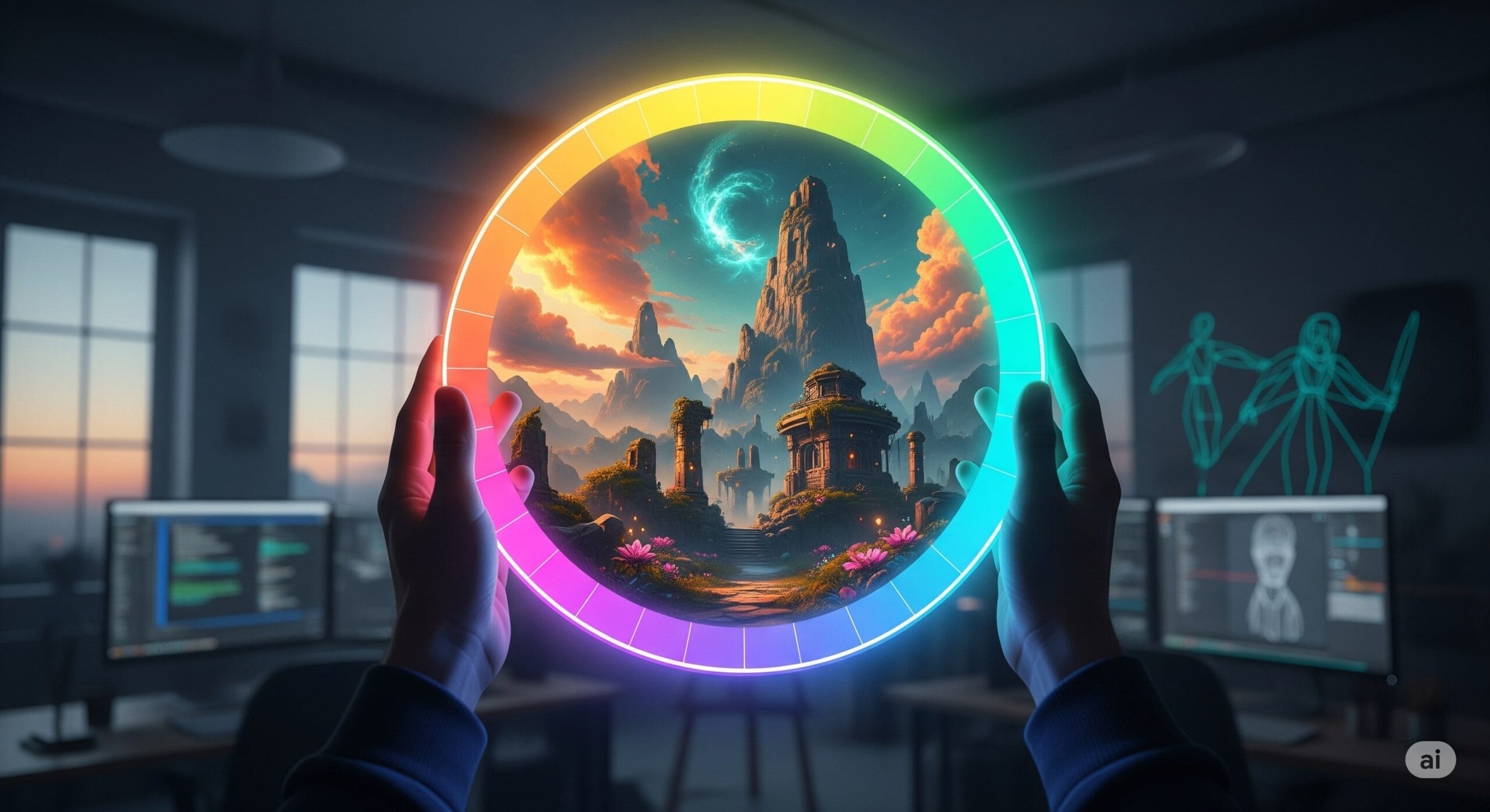
1.1 The Artist’s Color Wheel: From Pigment to Pixel
The primary tool for understanding color relationships is the color wheel. For artists, the most intuitive model is the traditional painter’s wheel, also known as RYB (Red, Yellow, Blue).
- Primary Colors: Red, yellow, and blue are the foundation.
- Secondary Colors: Mixing primary colors gives you orange, green, and violet.
- Tertiary Colors: Mixing primary and secondary colors yields hues like yellow-green or red-orange.
It is critical for a digital artist to know that while they think in the RYB model for harmony, their engine renders in the RGB (Red, Green, Blue) model. RGB is an additive system for light on screens, whereas RYB is a subtractive system based on how pigments mix. The RYB wheel simply provides a more intuitive framework for planning a scene’s color scheme.
1.2 Deconstructing Color: Hue, Saturation, and Value (HSV)
Every color can be broken down into three fundamental properties, and manipulating these three levers is the key to creating variety within a game world.
- Hue: This is the pure color itself, like “red” or “blue”. A common mistake for beginners is using too many distinct hues in one scene, which creates a visually cluttered environment.
- Saturation: Also known as chroma, this is the color’s purity or intensity. A highly saturated color is rich and contains no gray; a fully desaturated color is a shade of gray. High saturation creates excitement, while desaturation can convey a more somber mood.
- Value (or Lightness): This describes a color’s relative lightness or darkness. Value is arguably the most critical component for a readable composition. Differences in value create contrast, which is essential for defining form, creating depth, and establishing a clear visual hierarchy.
A foundational principle of environmental art is that a successful color composition is built upon a strong value composition. If a scene feels flat or unreadable, the first step is to examine it in grayscale to assess its value structure, not to change its colors.
1.3 Color Temperature: The Psychology of Warm and Cool

Color temperature divides the wheel into two halves that have deep-seated psychological associations.
- Warm Colors: Reds, oranges, and yellows. They are associated with fire and sunlight, evoking feelings of energy, passion, and comfort. In a composition, they tend to advance, appearing to come forward and command attention.
- Cool Colors: Blues, greens, and purples. They are associated with water, sky, and foliage, linked to calmness, stability, and sometimes sadness. Visually, they tend to recede into the background, creating a sense of depth.
This interplay is a cornerstone of environmental design. A highly effective strategy is to use cool colors for backgrounds and ambient light, with warm colors reserved for focal points and interactive objects.
1.4 Principles of Harmony: Crafting Cohesive Palettes
Color harmony is the theory of combining colors in a way that is visually coherent. Using established schemes provides a reliable framework for creating intentional palettes.
| Scheme | Description | Best For |
|---|---|---|
| Complementary | Two colors directly opposite on the wheel (e.g., blue and orange). | Creating high contrast, drawing attention to a focal point, and building energetic scenes. |
| Analogous | Colors adjacent on the wheel (e.g., blue, blue-green, green). | Designing serene, harmonious, and unified natural environments. Ori and The Blind Forest is a prime example. |
| Triadic | Three colors equally spaced on the wheel (e.g., red, yellow, blue). | Vibrant, visually rich palettes, though they can be harder to balance. Let one color dominate. |
| Monochromatic | Variations in saturation and value of a single hue. | Creating a strong, unified, and often dramatic mood, perfect for minimalist aesthetics. |
Section 2: The Psychology of Play – Directing Emotion and Behavior

Color is not merely perceived; it is felt. It’s a form of non-verbal communication that speaks directly to a player’s subconscious, shaping their emotional state and deepening their narrative engagement.
2.1 Emotional Resonance and Color Scripts
In many cultures, specific colors carry common psychological associations that designers use as a shorthand.
- Red: High-arousal emotions, from passion and energy to danger and urgency.
- Blue: Calmness, trust, and serenity; often used for tranquil environments or to represent stability.
- Green: Overwhelmingly associated with nature, growth, and safety.
- Yellow: High energy, cheerfulness, and optimism; excellent for grabbing attention for collectibles or power-ups.
This can be extended across an entire game using a “color script”—a visual plan that maps the game’s emotional arc to a deliberate progression of color palettes. A game might start with harmonious greens, transition to tense, muted grays, and culminate in a finale saturated with reds and oranges. This ensures the visual language is always aligned with the emotional stakes of the story.
2.2 The Cultural Palette: A Global Challenge
A critical and often overlooked challenge is that color symbolism is culturally dependent. Ignoring this can lead to unintended messages for a global audience.
- White: Symbolizes purity and peace in the West, but is the color of mourning and death in several East Asian cultures.
- Red: While danger in the West, it’s a color of luck, happiness, and prosperity in China.
- Blue: A color of trust in North America, but can be associated with trouble or mourning in some South American cultures.
This doesn’t mean designers must avoid certain colors, but it necessitates awareness, research, and strategic thinking, sometimes requiring regional adjustments to be successful worldwide.
Section 3: The Function of Color – Guiding the Player
Beyond psychology, color serves intensely practical, utilitarian roles. It’s an active element of the user experience that provides information, reduces cognitive load, and directs behavior.
3.1 The Art of Wayfinding
One of the most powerful functional uses of color is for wayfinding. Designers use color as a subtle guide to direct players, highlight the critical path, and signal interactive objects. This is effective because it trains the player to recognize a consistent visual cue, creating what psychologists call an “attentional set“.
The “single accent color” approach is famously used in several titles:
| Game Title | Guidance Color | Example Usage | Underlying Principle |
|---|---|---|---|
| Mirror’s Edge | Red | Doors, pipes, and ledges on the optimal parkour path are colored bright red. | High-contrast accent color creates a clear “attentional set” for fast-paced navigation. |
| The Last of Us | Yellow | Climbable ledges are marked with yellow paint; pathways are highlighted with yellow tape or cables. | The accent color draws the eye to affordances in a visually dense, realistic environment. |
| Uncharted Series | Yellow / Blue | Colorful pipes and bright ledges stand out against natural rock to mark climbable surfaces. | Color is used to make interactive traversal points readable at a distance. |
3.2 Visual Hierarchy and Systemic Communication
Visual hierarchy is the principle of arranging elements to show their order of importance. Color is a primary tool for this, ensuring a player can instantly distinguish between enemies, objectives, and the background. The human eye is naturally drawn to areas of high contrast, saturation, and brightness. Inexperienced designers often create “mushy” compositions where foreground and background have similar values, making the scene hard to read.
Color is also used to build a consistent, symbolic language for game mechanics.
- Affiliation: Blue/green is almost universally used for allies, while red is used for enemies.
- Status and Feedback: Red is standard for health bars and damage indicators. A red vignette on screen signals low health. Blue or purple is often used for mana or shields.
- Information and Rarity: In UIs, green means “confirm” while red means “cancel”. RPGs and looter-shooters use a color-coded rarity system (grey, green, blue, purple, orange/gold) to communicate item value at a glance.
3.3 Designing for All: Accessibility and Color Vision Deficiency
A crucial responsibility is ensuring games are accessible to players with color vision deficiencies (CVD). Relying on hue alone is a major accessibility failure. To create inclusive designs, color cues must always be paired with redundant information.
Best practices include supplementing color with:
- Shape: Use distinct shapes or icons (e.g., a green circle for “confirm” and a red square for “cancel”).
- Texture or Pattern: Apply different patterns to elements that are otherwise only distinguished by color.
- Brightness Contrast: Ensure a significant difference in value (lightness/darkness) between important elements.
- Animation: Use blinking or motion cues to draw attention, as Blizzard did in World of Warcraft by making a quest tool blink.
Providing dedicated “colorblind modes” that remap the game’s palette is also a crucial feature.
Section 4: The Technical Canvas – In-Engine Implementation
Understanding color theory is only half the battle. An artist must also master the technical tools that control color within a game engine.
4.1 The Physics of Light and PBR
In a game engine, an object’s color is the result of its surface interacting with the light that hits it. A white wall will appear yellow under yellow light and blue under blue light. This means the final color of any surface is a dynamic calculation, not a static texture map.
Physically Based Rendering (PBR) is the standard methodology for simulating this behavior in a plausible way. For artists, this means creating materials that adhere to a few physical principles. The key texture maps an artist authors are:
- Albedo/Base Color: The material’s diffuse color, authored without any lighting or shadow information baked in.
- Roughness/Glossiness: Controls how smooth or rough a surface is, which determines if reflections are sharp or blurry.
- Metallic: A map that defines if a material is a metal (which has tinted reflections and no diffuse color) or a non-metal/dielectric (which has a diffuse color).
4.2 Lighting, Fog, and Post-Processing

Artists use a suite of tools in engines like Unreal and Unity to control the final color and mood of a scene.
- Lighting: The Directional Light (sun), Skylight (ambient light from the sky), and Point Lights (lamps, etc.) are the primary sources that determine how materials are colored in the scene.
- Fog: Exponential Height Fog creates atmosphere and tints distant objects, which is a powerful tool for setting mood and creating depth.
- Post-Processing: These are filters applied to the final image, giving artists a final layer of control. Color grading is the most important of these, allowing artists to adjust the hue, saturation, and brightness of the entire scene to achieve a cinematic look, similar to filmmaking. This can be done with tools like color curves or by applying a pre-made Look-Up Table (LUT).
This modern workflow means lighting and post-processing skills are no longer optional specialties; they are core competencies for any environment artist.
Section 5: Case Studies – Deconstructing Excellence

Theory is the map, but analyzing masterworks reveals the destination. Each of these games represents a distinct and masterful philosophical approach to color.
5.1 Journey: The Emotional Arc as a Color Script
Journey stands as the quintessential example of using a dynamic color script to drive a wordless narrative. The entire game is a visual representation of a classic “fall into misfortune followed by a triumphant rise” story arc, with the palette directly mirroring the player’s emotional journey.
- Act I – Hope and Wonder: The game begins in a desert dominated by warm, hopeful colors: golden-orange sand and the vibrant red of the player’s robe. This high-saturation palette evokes energy and encourages exploration.
- Act II – Danger and Uncertainty: As the player descends into underground ruins, the color palette shifts dramatically to cool, mysterious, and ominous tones. Deep blues and muted purples create an atmosphere of tension and foreshadow the game’s antagonists.
- Act III – Despair and Transcendence: The final mountain ascent reduces the world to cold, desolate blues and grays, stripping it of almost all color. This monochromatic environment powerfully communicates struggle and the approach of death. After collapsing, the player is reborn into an explosion of vibrant, highly saturated whites and golds, creating a feeling of elation and spiritual triumph.
In Journey, the environment’s color is the primary storyteller.
5.2 Firewatch: Stylized Realism and a Pervasive Mood
Campo Santo’s Firewatch demonstrates how a consistent, highly stylized, and bold color palette can establish a powerful sense of place and mood. Inspired by mid-20th century National Park posters, the art does not aim for photorealism but for an emotional realism. The game world is drenched in a rich palette of hazy oranges, deep reds, and golden yellows, contrasted with the cool blues of distant mountains. This look was achieved by simplifying natural forms into bold shapes and using advanced color grading to “paint” over the entire scene, pushing the warm hues to create the game’s signature aesthetic. The warm, beautiful world serves as a constant, melancholic counterpoint to the protagonist’s isolation and anxiety.
5.3 Inside: Reductive Minimalism and Lighting as Color
Playdead’s Inside is a masterclass in how an extremely minimalist and desaturated palette can create one of the most oppressive and memorable worlds in gaming.
- A Near-Monochromatic World: The game world is almost entirely composed of blacks, whites, and a spectrum of grays. This severe restriction immediately establishes a bleak and somber tone.
- Color as a Focal Point: Because the world is so desaturated, the rare instances of color have immense visual weight. The protagonist’s bright red shirt serves as a constant focal point, ensuring he is always visible and symbolically representing a spark of life in a world of mindless conformity.
- Lighting as the Medium: The game’s incredible sense of depth and mood is achieved almost entirely through the masterful use of light and shadow. The developers “hand-painted” the lighting for every scene, using techniques like volumetric light rays and backlighting to carve the world out of darkness.
Inside proves that a powerful atmosphere does not require a complex palette; by stripping color down, Playdead turned light itself into the primary artistic medium.
Conclusion: The Unifying Element
The effective use of color in game design is a sophisticated craft standing at the intersection of art, psychology, and technology. It is a foundational system capable of communicating narrative, manipulating emotion, and guiding gameplay with a power that often transcends words. The masterworks of the medium demonstrate that the most impactful worlds are not necessarily the most colorful, but the most intentional. A deep, deliberate application of color theory is what separates merely functional environments from truly unforgettable worlds—worlds that capture our imagination and resonate with us long after we have put down the controller.
Basics of Color Theory for Game Environment Design
Understanding Color Combinations
Color combinations play a crucial role in creating an immersive game environment. Different color theories can help game developers select the right hues to enhance gameplay.
Utilizing the Color Wheel
The color wheel is a fundamental tool for game designers, illustrating the relationships between colors. Understanding the sides of the color wheel can aid in creating effective color schemes.
Color Harmony in Game Development
Achieving color harmony is essential for visual design. By exploring analogous color schemes and complementary colors, game developers can create a cohesive look.
Ready-to-Use Color Palettes
Ready-to-use color palettes can simplify the design process. Game developers can select palettes that suit the general atmosphere of the game.
Different Color Schemes for Game Art
Experimenting with different color schemes, such as monochromatic or analogous color schemes with blue and green, can enhance the visual appeal of game assets.
Color and Light in Game Design
The interaction between color and light sources significantly affects the overall design. Understanding how light may alter color perception is vital for immersive experiences.
Applying Color Theory in Game Levels
Game designers must apply the basics of color theory to create engaging game levels. Effective color selection can guide players and enhance gameplay.
Science of Color in Interactive Design
Understanding the science of color helps game developers create environments that immerse players. Color value and temperature can influence the mood of a scene.
Understanding Color Blindness in Game Design
When designing for inclusivity, it’s important to understand color blindness and how it can affect players’ experiences. Utilizing colors that are distinguishable to everyone is key.
Learn More About Color Theory
Game developers should continually learn more about color theory to improve their understanding of color and its impact on game design.

Game Developer | Designer | Creative Storyteller
Matt Dogherby is a passionate game developer and designer based in Brisbane, Australia. With a career spanning over 15 years, Matt combines technical skill with a deep love for storytelling to create games that captivate and inspire. His unique perspective is shaped by the laid-back energy of Brisbane and his lifelong connection to the ocean, where he often trades coding sessions for surf sessions.